All these years, we have been waking up to new stuff and new changes in technology. Each day there is something new happening in the tech world. With Windows 8 to be launched very soon, Microsoft has finally unveiled an all new logo for the Windows 8 operating system.

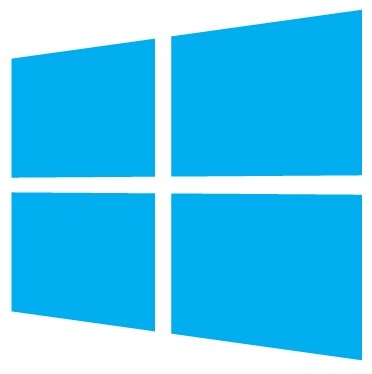
The new Windows 8 logo is totally different from the regular Windows logos which used to be colourful windows / flags. The new logo is just all blue in colour and looks like a set of 4 windows panes placed next to each other as you can see above. This is all good until we came across the Windows 1.0 Logo (Windows 1.0 was the first ever usable version of Microsoft Windows, which was launched some good 25 years back. How does it feel to back 25 years just after waking up in the morning?
The Windows 1.0 logo bears an uncanny resemblance with the new Windows 8 Logo and even you can feel it after you see the Windows 1.0 logo, below. So, all this pomp and show only to get back to from where all it started? Well, we are just kidding. The new Windows logo definitely looks smarter.

Here are two points which Microsoft had in mind while designing the new Windows 8 Logo:
1. A modern but classic logo with an underlying Swiss design
2. Keep the Metro UI principle of being “Authentically Digital”
Shown below is another Logo which is a simple edit of the Original Windows 8 Logo. This edited version was made by Long Zheng of iStartedSomething and to us, this one looks a bit more “Metro UI” – ish.
