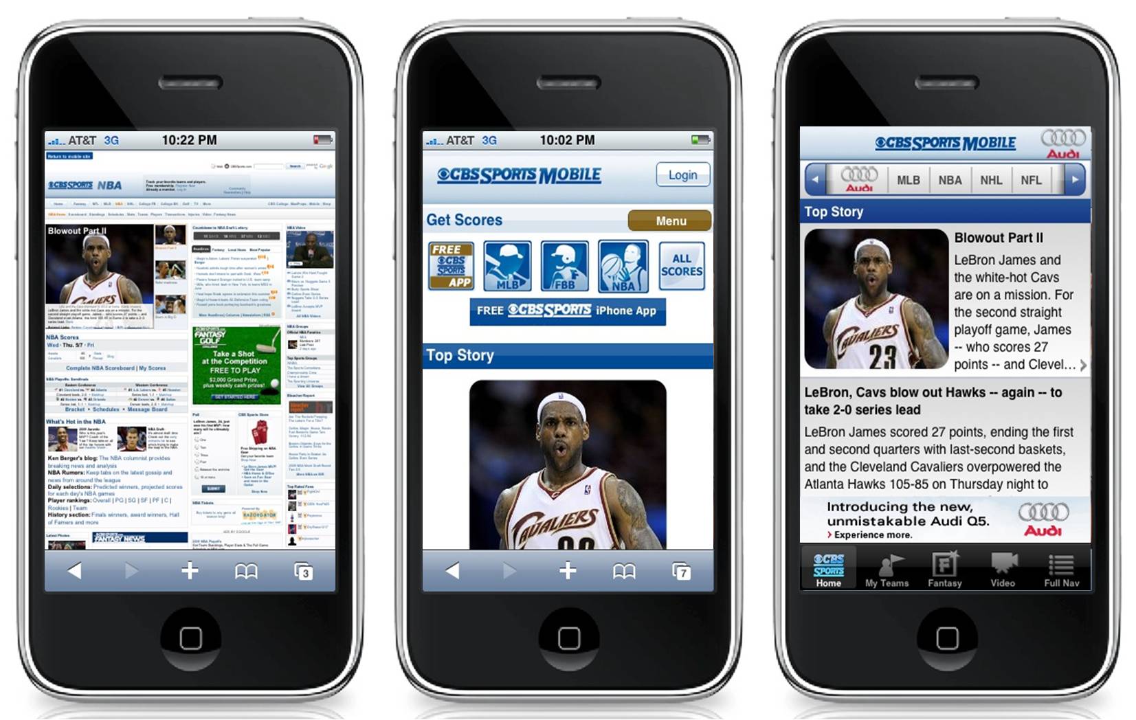
The Changing Landscape of Mobile Design – 6 Insights
As we settle into 2013, the world is changing around us – the technology world, that is. The tech world is getting faster, smaller, and trendier. We are constantly plugged in. On my morning commute, I read the news on my tablet, while my neighbor reads on a Kindle. Behind me a girl is watching a TV show on her laptop; in front of me, a guy is playing Angry Birds on his iPhone. We’re surrounded!
You may not have been aware at the time – don’t worry, most people weren’t – but something unusual happened during the last quarter of 2012. While you were running around getting last minute gifts and sitting at home with your family sipping hot chocolate, PCs were shivering on the corner. There was a drop in PC sales, for the first time since 2001. And not just a tiny fraction of a percent drop – sales fell by 6.4%. Unsold PCs, boxes lined up on shelves, sit with their prices getting slashed and slashed.
Where did the PC market go?
It’s not that we’re moving away from computers – sales of smart phones and tablets are up. Way up, in fact. For many across the world, a cell phone is more accessible than clean drinking water. These tiny computers pack quite a punch; with processors stronger than Apollo 11, they get us through the morning commute and then some. It is these gadgets that are eating up the sale of PCs – and they’re having the laptop market for dessert, too. By 2015, the sale of tablets is projected to eclipse the sale of laptops, and they’ll only keep going from there.
If you think about it, as tablets get stronger and stronger, is there really much need for laptops at all? Those requiring large amounts of processing power – PC gamers, designers, musicians, videographers – will continue using desktop computers for a long time. But for people doing light computer tasks – browsing YouTube, socializing on Facebook, holding a Skype call – laptops are starting to become a thing of the past. Why use a bulky machine when you could do the same thing with a lightweight tablet?
With these changes to the tech landscape come changes to the digital one. In years gone by, any old Joe who was familiar with a little HTML could design a website for his business or his science fiction blog or his pet cat. Now, web design is a sprawling field, with a massive number of disciplines – designers, developers, user interface specialists, internet marketers, ecommerce specialists, mobile interface specialists, app programmers – and not to mention the whole project management software industry that has built itself up around it. It would take a savant to know all there is to know about web design today.
Ten years ago, the most we had to worry about regarding screen size was whether the resolution was set to be in 800x600 or 1024x768. Today, people still visit websites in those resolutions – but also from the tiny screens of their smartphones and the enormous displays in their office.
We have devices with HD displays, but we also have devices with retina displays, with pixels too tiny to distinguish with the naked eye. People access the internet from their cell phones, their tablets, their mini tablets, their laptops, their e-readers, their desktop computers, their gaming consoles. All of these possibilities create a nightmare for website designers, but you can’t just ignore them.
Last month, Mashable called 2013 the “Year of Responsive Web Design” They have just undergone a change to a vastly different design. The new design is adaptive, flowing to fit a screen of any size perfectly. Other websites have tried to fulfill the same need, because the majority of mobile visitors don’t want to have to download an app to view your content – they want to see it right in their mobile browser. Platforms like WordPress already have free and premium themes available that respond to screen size and device type.
Not everyone agrees that responsive design is the future, however. In a post she wrote for Forbes, Carin van Vuuren argues that we need to push for the acceptance of mobile apps, since responsive design cannot respond to changes in functionality between devices. Switching to responsive design may have been a great choice for Mashable, with an audience that is 30% mobile and with little change in functionality between devices, but it wasn’t an option for her example, LinkedIn.
LinkedIn needed to provide a different interactive experience for mobile users, who they believed browsed the site with a different set of goals in mind. To cater to these goals, they built a powerful HTML5 iPad app.
No matter which side of the fence you are on about responsive design, it is here to stay, and the internet is going to change with it. Websites will be going back to the basics, with clean, simple designs that can stretch to fit an enormous monitor or shrink to the basics on your smartphone.
Those who play nice with a variety of devices will see growth in their audience, whereas those only accessible from larger devices may see their traffic shrink as the world turns away from desktops. Where will that leave you?
Adrienne is a blogger and aspiring writer. When she’s not blogging about tech and social media, you might find her practicing her French, whipping up some recipes she found on Pinterest, or obsessing over vintage postcards and stamps.
Image - blog.pointroll.com/aducation/in-app-vs-mobile-web-whats-the-difference
