Did you come across some changes in the Google Search Page lately? The changes, though are not visible for many of the users, Twitter and other social media tell that many have come across it. As Google has gone for a bucket test where it makes the changes for few users to get a response and work accordingly, so not all users are seeing this.
Some of the changes made are :
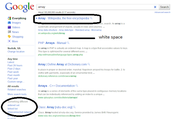
- Addition of contextually relevant, left-hand navigation to the page. There is a new side panel which highlights the most relevant search tools and helps in refining the query.
- Update of look and feel in terms of color palette and our logo. The colors are too soft.
- Result links are no longer underlined.
- The new design is too sparse. It has got a lot of white spaces in between.
- Each search item is now separated by a dotted line .
Google says that the new changes help users to exactly find what they are looking for and also claims that the newer version is surely meant for betterment.
Many people over Twitter and elsewhere have shown a dislike for the new look. They claim that the search page, now has gone Bingified, as the new look appears somewhat like Bing (Microsoft’s Search Engine). Though this thinking is quite implausible.
Let’s hold on till all the changes are incorporated fully. We would surely be interested in some nice changes. Below are some changes hi-lighted on a search result’s page.
Source : Google
