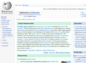
 Wikipedia, the largest online encyclopedia, has just updated its site design to a new cleaner and more appealing design. Not only that, they have introduced a lot of new features designed to make editing and navigation easier. This is the first major initiative between the Wikimedia Foundation and its millions of volunteers on the usability front for Wikipedia. However, they have already been rolling out new design and features in Wikinews and Wikimedia Commons for about a year.
As of now the changes are available only in Wikipedia English, but they will be available soon enough in the other languages as well.
Here are the changes that have been introduced:
New Theme
A new theme called “Vector” has been introduced. This theme is designed to make the important functions easier to find. Moreover it is a lot cleaner and looks more appealing (although its a matter of taste).
Improved Navigation:
Navigation has been improved both for when you are reading or editing an article. Items that are not used often are now hidden in the form of a collapsible menu.
Easier Editing
The editing toolbar has been reorganized to make it more intuitive and easier to use. Creating tables is now more simpler with the addition of a new table wizard. There is also a new link wizard to make addition of links easier.
Improved Search
The search suggestions are now improved to get you to the page you are looking for more quickly.
By the looks of it, the new changes are a welcome change and sure to improve the user experience at Wikipedia. The easier editing may now make more people create or edit articles. The Wikimedia Foundation also promises that more changes are to come.