 Yesterday we told you about the released of Clementine 0.4. We have done a review of Clementine 0.2 earlier. However, a new release calls for another review. Read on.
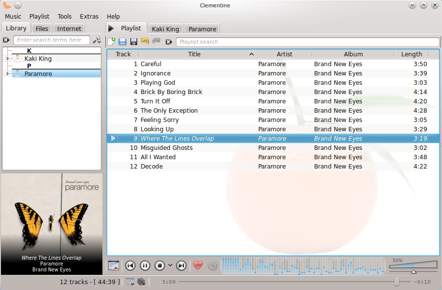
Clementine 0.4 has a vastly improved UI compared to Clementine 0.2. The player now displays the cover art of the song being played, adding a huge visual improvement over the previous release. The Library, Files and Internet tabs have been moved to the top which makes much more sense.

While still maintaining the no-nonsense look, Clementine 0.4 has managed to bring in a lot of new features. The most visible improvement is in the Playlist. It now has options to Save, Load etc. There is also a Playlist Search, which works perfectly.
However the biggest change with the playlist is that it now supports tabs. You can now have different playlist in different tabs. While this feature sounds very good, I cannot understand why I would like to have multiple playlists open in different tabs. Anyway the playlist does not look boring as it did in Clementine 0.2.
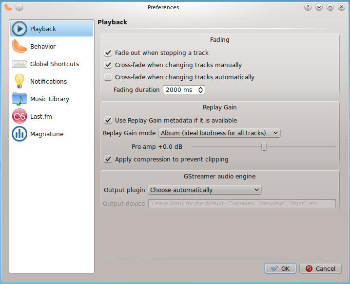
Other than the improvements in the UI, Clementine 0.4 also has some other new features as well. It has added support for Magnatune. However I cannot get it to work. It also supports Realplay, which uses the Realplay metadata to adjust the loudness.
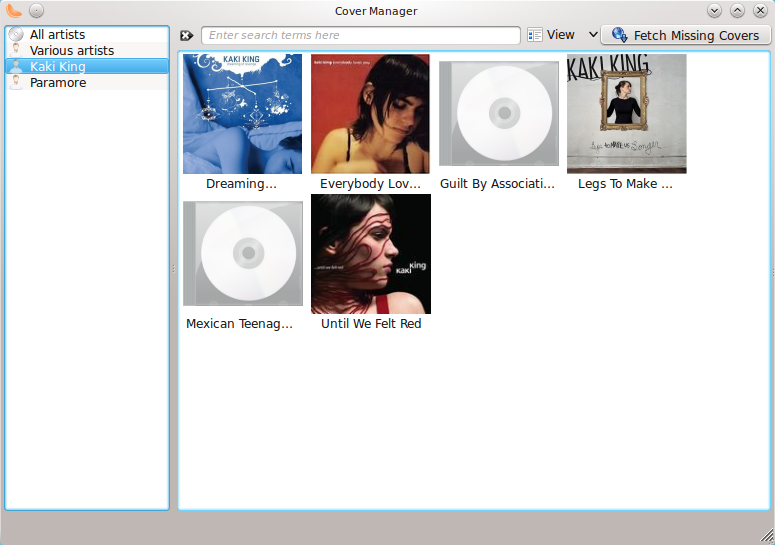
Clementine 0.4 has a new cover manager, which can download the album art on its own. A lot of other players have this feature and this is indeed a welcome addition to Clementine 0.4.
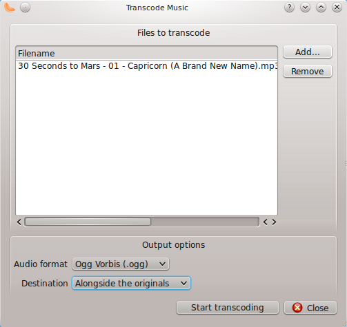
Transcoding of audio files into different formats like OGG, FLAC, MP3 etc is also supported in Clementine 0.4. This should be enough for almost everyone.


