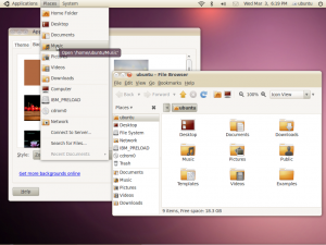
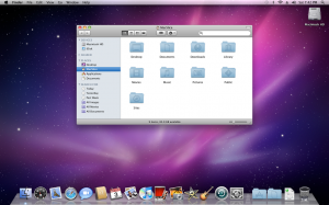
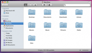
 By now, you must have know or atleast heard about Ubuntu’s rebranding. Canonical has changed a lot of things about Ubuntu from the font used in its logo to its default theme. Talking about the theme, Ubuntu has made a radical departure from its typical brownish theme to a new “light” theme. While there is no doubt that the new theme looks much better than the previous human theme, anyone who has seen it cannot help but notice that it looks suspiciously like Mac OS X.
So, here is the new Ubuntu on the top and Mac OS X on the lower one. It is really hard to not notice the similarity.
Lets look at the similarities in a little more details.
Monochromatic icons
The one on the top is Ubuntu and that below it is Mac OS X. See the similarity? Earlier versions of Ubuntu have a colored icons in the panel. With the new theme that is being proposed for Lucid, it has been replaced by monochromatic icons.
Icons
If we look a little more closely at the icons, it is clear that the similarity is not in the color only. It looks like Ubuntu have completely ripped off the Mac icons.
Windows button placement
Earlier versions of Ubuntu used to have the minimize, maximize and close buttons of the windows on the right. With the light theme, it has been shifted to the left – that is also where Mac OS X has its buttons.
Wallpaper

- Ubuntu
On the right is the default wallpaper that is to be used in Ubuntu Lucid and on the right is the default wallaper of Mac OS X. Lots of purple – similar?
With so much similarities, there is no doubt that Ubuntu is trying to look like a Mac. The only things that seem to be missing now seems to be the Apple logo and the dock.
There is no denying that Mac OS X has one of the best looking UI and the new Ubuntu “light” theme also looks very beautiful. From my experience, I have seen that one of the primary thing that attracts people to an OS is the looks. Factors like usability, stability etc. generally come later after using it for sometime. A lot of people that I have shown Ubuntu to have dismissed it because it looks “ugly”. With the new “Mac” looks Ubuntu is sure to attract a lot of newbies.
But let us talk about identity. Popular OSs like Mac OS X, Windows, Ubuntu are instantly recognized because of their unique look. This creates an identity of the OS among the general people. Even many of my friends who do not use Ubuntu knows of its brownish looks. Although many hated it and called it ugly, Ubuntu is instantly recognized due to brownish looks. However, by copying a Mac, Ubuntu has effectively given up this identity. Will this means its image is now reduced to a Mac-look-alike? This is very unfair to an excellent OS.
I know the Ubuntu community has many exceptional people. Surely, coming up with a good looking OS which does not scream “rip-off” at first glance should not be such a big task for them.


