Twitter, as we all know, has become very big these days with everyone from regular users to celebrities ranting away their respective lives on the microblogging website. Twitter has also become a really dependable way of verifying any news or incident that might have occurred at some corner of the world.
Well, I also happened to recently join Twitter. I created an account, logged in and was greeted by Twitter’s suggestions which asked me to follow a couple of famous Twitter accounts and then I finally got to see my Twitter homescreen.
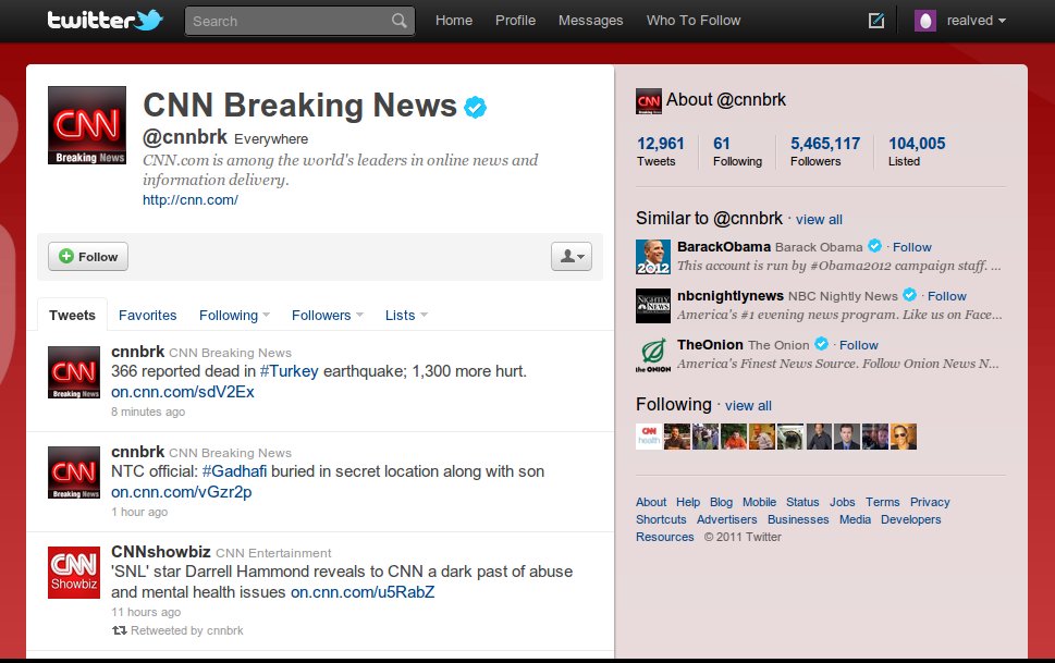
So far so good. I clicked on some of the profiles and landed on the CNN Breaking News twitter account (@cnnbrk) But wait, How Do I Tweet? There is no link or text that guides me on how to post a Tweet. I joined Twitter to post updates about my activities and now do not know How to. Shown below is a screenshot of the page I am talking about:

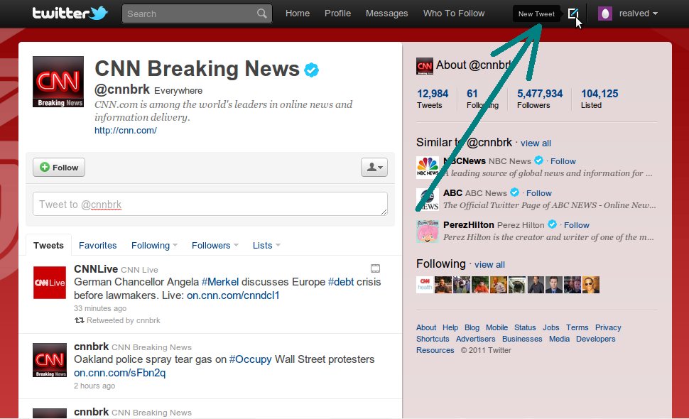
After struggling around a bit, I finally figured out the small icon on the top clicking on which brought about the Tweet a new message box as an in-page popup. One thing I noticed, when I hovered on that “new tweet” icon a text appeared on the left saying “New Tweet”. Check this screenshot below:

Well, my humble suggestion to twitter is that they could simply display the “New Tweet” text next to that button all the time. I am sure that will make it easy for fellow newbie Twitter users to easily post updates.
This post has been written by Raghav Ved Iyer, a third year computer engineering graduate. Follow his tweets on @relved