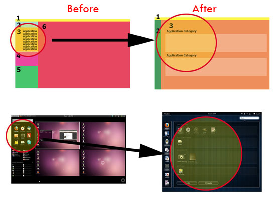
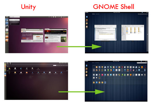
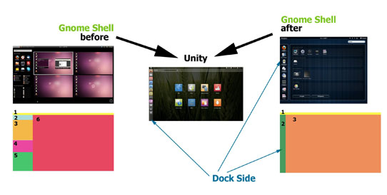
In the past I have commented on how GNOME Shell’s redesign is heading towards what Canonical’s Unity looks like currently. Well, today a reader, Frederico Araújo, left a very interesting side-by-side comparison of GNOME Shell during its initial stage and now. He also added comparison with Unity. It is a very interesting comparison and we thought we’d share it. Do leave your thoughts in the comments.
The original image is very large, so we have divided it into four parts. (Click here for the original image.)
 This image gives an overall layout of the different items in Unity and in GNOME Shell during its early stage. Note that Unity still looks like that even now.
 This is a comparison of how much GNOME Shell has changed from its original design.
The next two images compares the current design of GNOME Shell with Unity.

