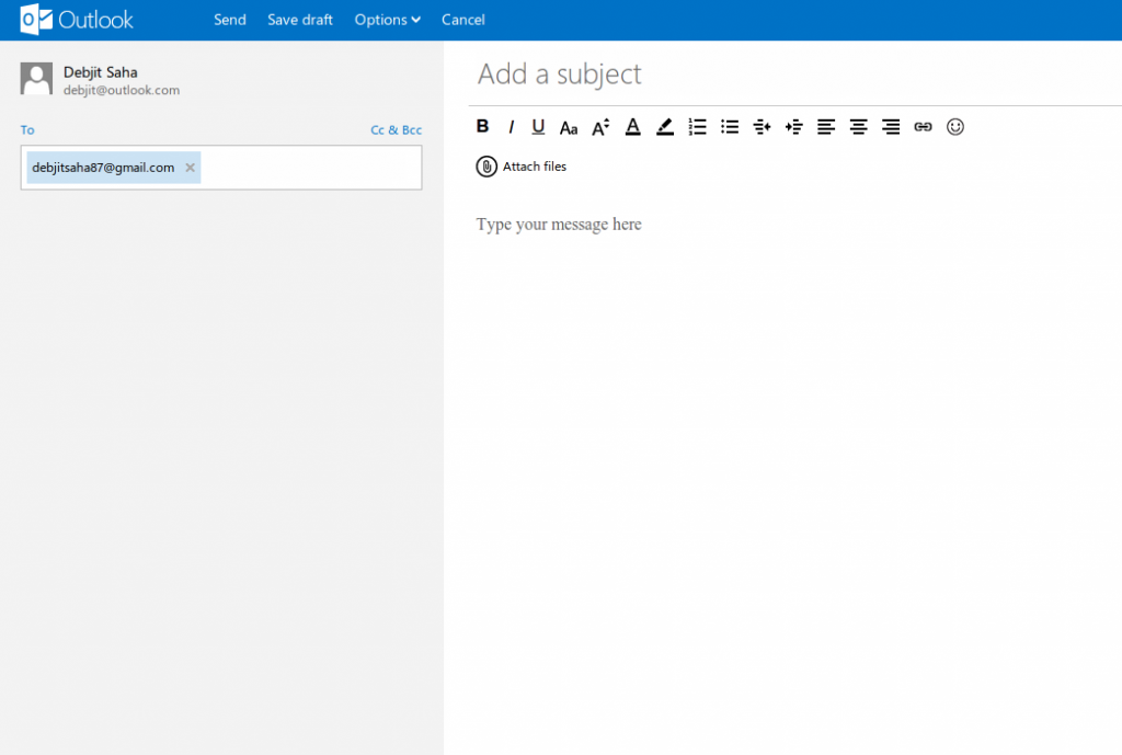
So, I finally got my prized [email protected] email address. I am kind of really liking the refreshing new look of Hotmail, err Outlook.com. So far so good, after signing in I went ahead to compose a test mail. After I was done, I got stuck and was unable to find the Send button! After looking around for a while I located the Send button at the top, which is more of a link.

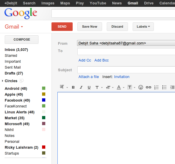
Well, this is exactly what Hotmail.com needs to fix right now. I am not a UX guru or a UI designer, but I am a heavy webmail user and I exchange a lot of mails daily between myself and my co-workers. Having the Send button stand out is really important for a web based mail service. This is where GMail really stands out:

Hope, some one at Microsoft is listening 🙂