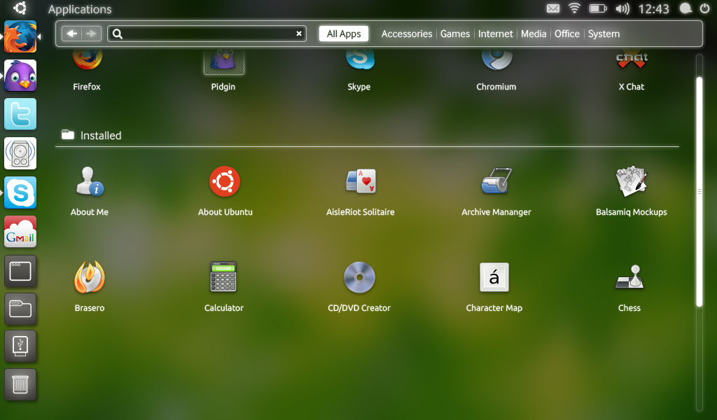
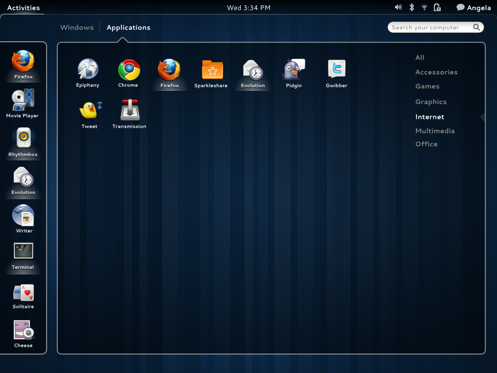
Today I saw a mockup of GNOME Shell and cannot believe at how much it looks like Unity, the UI which Canonical is developing for Ubuntu Netbook Edition.
Have a look :
The current GNOME Shell interface is a lot different from this mockup. However, this mockup is interesting because it looks like it has been inspired by Unity – in fact, it looks exactly like Unity.
What I cannot understand is, why would they copy Unity of all things? Unity is meant for netbooks – you know the ones with small 10-inch – and Shell is meant to replace the traditional desktop – from 10-inch netbooks to those huge monitors in desktops. There is a big difference in what Unity is aiming for and what Shell is supposed to do.
Yes, this is just a mockup and I might be freaking out unnecessarily. Maybe it will never see the light of day.
Anyway, now that they have some extra time after GNOME 3.0 has been pushed back, I hope they improve the existing Shell interface rather than going for a new interface.
[image credit: OMG!UBUNTU!]

