Visual Tour of GNOME 3 Shell (in Ubuntu 9.10)

Advertisements

gnome_logoGNOME 3 is the much talked about next generation GNOME that was supposed to come in Ubuntu 10.04 Lucid Lynx. (Update: It has been confirmed that GNOME 3 will be delayed till atleast September 2010. So it will most probably come with Ubuntu 10.10 not 10.04.) It introduces a radical shift from the interface found in GNOME 2.x. In this article we will give you a quick visual tour of GNOME 3 in Ubuntu 9.10 Karmic Kola.

Click on the images to see a larger picture. You might like to read this article on how to install GNOME 3 Shell on your system.

gnome3_1

This is the screen you will be greeted with one you login to the GNOME 3 Shell. It seems like they have done away with the two panels system that we are used to in GNOME 2.x. GNOME 3 has just one panel at the top and it consists of five parts. Starting from left it consist of the following:

  • The first from the right is Activities. This consist of the various avtivities that you can do – like launch a new application, search, go to a new location, recently opened files etc.
  • Just to the right of Activities is where you get the name of the currently active application.
  • Right at the middle, you get the clock.
  • To the right of the clock you get the various applets running like the volume control, network manager etc.
  • And to the extreme right, there is the name of the current user and by clicking on it you get the menu to log out, shut down and some other functions that we will be coming to later.

gnome3_2

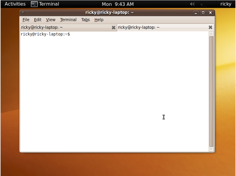
This is what an application running in GNOME 3 Shell looks like. Notice that “File Manager” next to Activities in the previous picture has been replaced by Terminal here reflecting the presence of the terminal as the currently active application.

gnome3_3

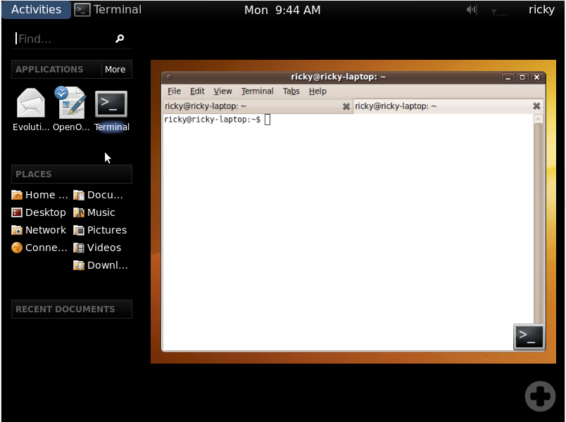
When you click on Activities, this is what you will get. The size of the desktop has been minimized a bit and a new menu comes up to the left. Starting from the top, the left panel consist of the following:

  • A search box using which you can search for both applications and documents.
  • Applications, which list the your favorite applications just below it. There is also a More menu you can go to to select other applications.
  • Then there is the places listing the different commonly accessed folders like Home, Music, Videos, Documents etc.
  • The last one is the Recent Documents under which recently opened documents come.

To the right, there is the desktop(s). If you have more than one virtual desktop, they all show up here. We will come to this again later.

gnome3_4

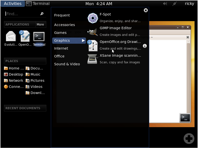
We mentioned the More menu next to Applications above. This is what clicking on it brings up. Basically it brings up two new panels. The left one list the various categories of applications and the applications available under that category is listed on the right one.

gnome3_5

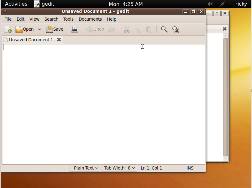
For this demonstration, I choosed to open Gedit from the menu seen the previous picture. So here is Gedit above Terminal and as Gedit is the currently active application, Terminal in the panel has been replaced by Gedit.

gnome3_6

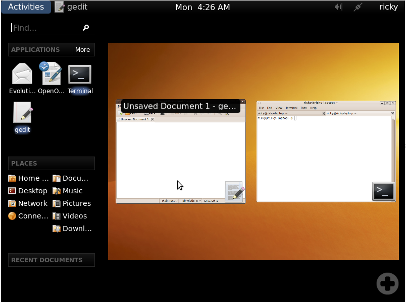
Now, if you click on Activities again, the two running applications are shown side by side and accompanied by their corresponding icons. When you hover the cursor over any of them, its name is indicated and by clicking on them you can go to that application. Also note that at the left panel under Applications, Terminal and Gedit are highlighted, indicating that they are currently running.

gnome3_8

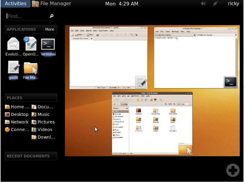
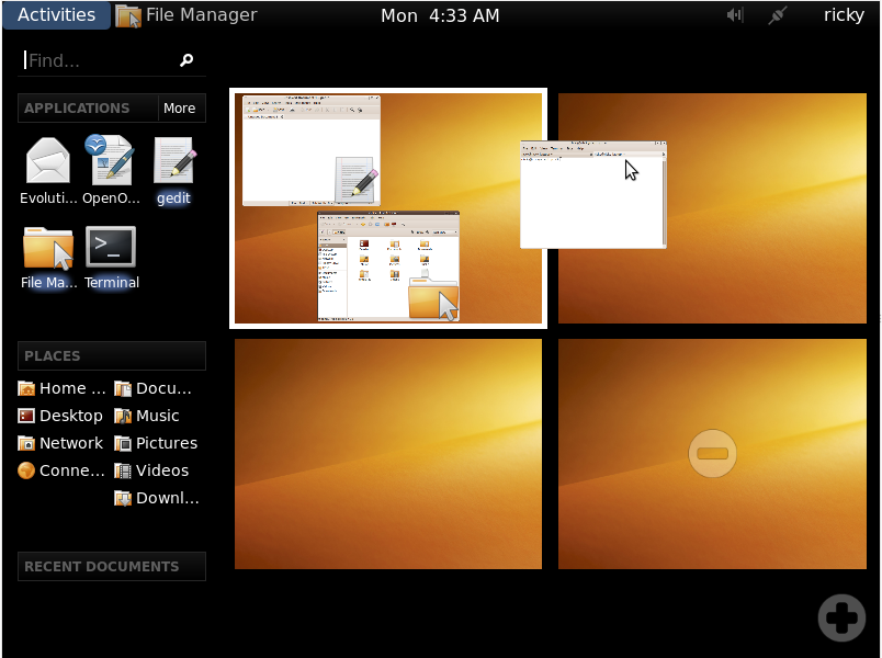
If you open more windows in the current desktop, the windows are automatically arranged to give you the best possible view.

gnome3_9

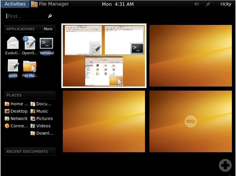
Now, what you are seeing here is arguably the coolest thing about GNOME 3. Instead of pre-defining the number of virtual desktops as was the case in GNOME 2.x, you can go on dynamically adding new virtual desktops by simply clicking the “+” in the bottom right. To go to any of the virtual desktops, just click on it. For this demonstration, I have added three more virtual desktops to make it a total of four virtual desktops. Notice that the active desktop is indicated by a white border.

gnome3_10

If you want to get a window from one desktop to another, just click on that window and drag it to the desired desktop and drop it there just like you drag and drop a file.

gnome3_11

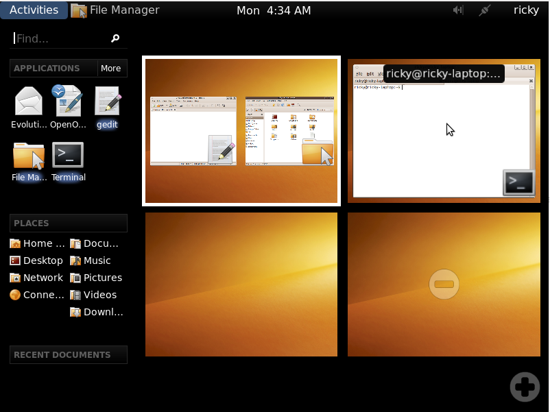
And once you have dropped a window into a desktop, it assumes its proper position in that desktop and the desktop from which it came also rearranges the windows to give optimum view.

gnome3_12

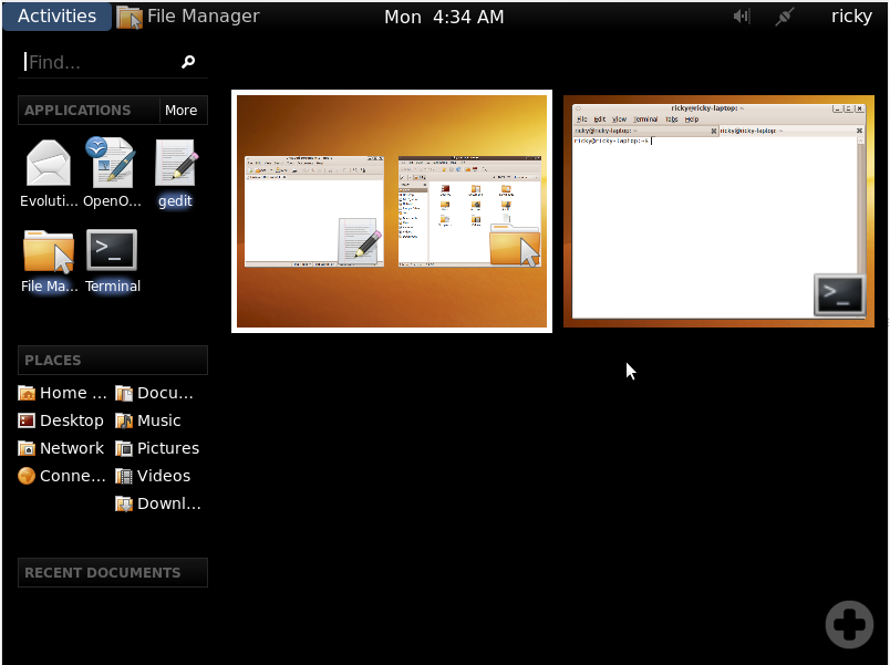
We have talked about how to add virtual desktops. To remove virtual desktops, all that you have to do is click on the “-” symbol at the center of each empty virtual desktop. In this demonstration, I have removed the last two virtual desktops.

gnome3_13

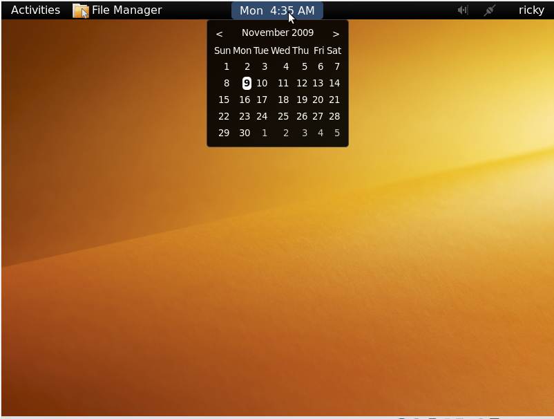
Going to the other parts, clicking on the clock drops down a calender.

gnome3_14

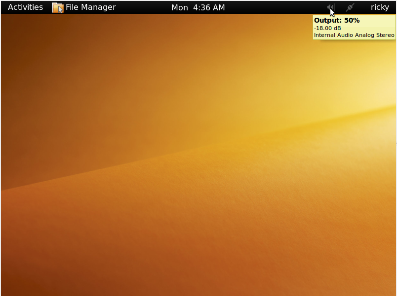
Further to the right, we have the running applets. Here, I have the volume applet and the network manager applet running and the volume applet is being indicated by the cursor.

gnome3_16

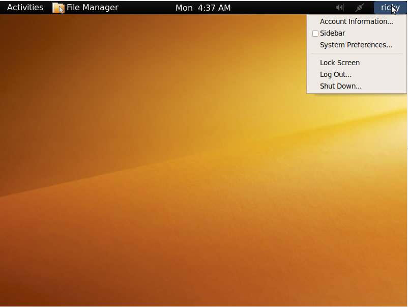
To the extreme right is the name of the current user. Clicking on it reveals a menu. Lock Screen, Log Out and Shut Down in the menu does the obvious. The other options are discussed below.

gnome3_17

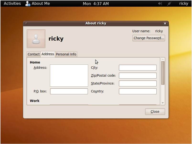
Clicking on Account Information brings up the window shown above. It basically shows informations about the current user. The password can also be changed from here.

gnome3_18

Checking Sidebar, reveals a sidebar at the left of the desktop. The sidebar consist of the time, applications and recent documents. As of now this seems redundant to me and its utility is not clear when there is the Activities screen. The sidebar can also be minimized.

gnome3_19

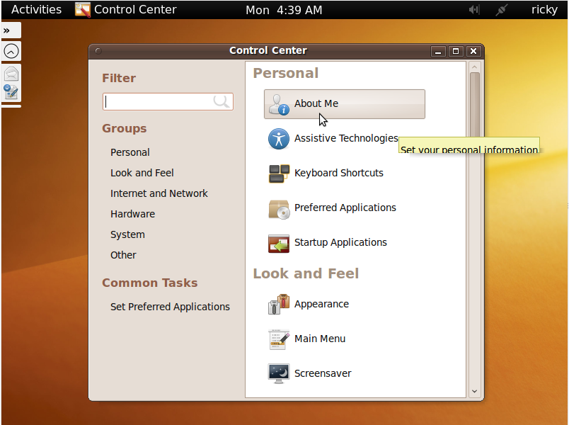
This is the Control Center which comes up when you click on System Preferences. From here you can modify various settings of your system. The minimized sidebar is also shown in the left.

With this we come to the end of our visual tour of GNOME 3 Shell. If you have any questions, opinions or any comment, feel free to discuss it in the forum or leave a comment below.

If you want to try it fist hand, go to this article.


Buzz This    


     Leave a Comment      Browse the Archives     


  • yo
    I used it and I found it really lame, it seems their desire to "stand out" made them do all these useless and impractical changes, I hope you can customize it to make it like it's now, I use the awn dock anyways but I don't really like the "activities" idea, why don't they just redesign the applications bar a bit to make it nicer, I don't see how you can use a computer without being able to switch running applications with one click, it's stupid. Also are they making any changes apart from this?? it seems like the only thing they had changed is this and it's for the worse, why should anyone upgrade?
  • Debjit
    tst comment
  • Chad
    Wasted space on each side of the clock. Don't waste space, bring the task bar back. I like to see all applications without clicking. I love everything else.
  • clint
    i agree with a lot of the issues here.

    First off i DO think its a good idea that gnome is moving away from a windows based setup and styling itself as an individual desktop environment. However, they gnome team seem to be ignoring the most basic usability heuristics here.


    It now takes MORE time, effort and clicks to move between active windows. This is nuts, the taskbar is gone!!! why was it removed, having a picture of what you are currently running is useless, i need to be able to move through programmes quickly and easily, not have to alt + tab every time, or zoom out to the gnome display! they should give the taskbar a refreshed look and move that stupid clock back to the right, cus they are just ignoring all the free landscape of the taskbar that can be used for functionality. and as the above posted, now every time i want to launch a new programme i have to zoom out, gnome-do is perfect, why take it away and add this rubbish?

    Im also hoping that they integrate the universal key bindings!

    Also, when you are in the full menu mode, to switch between windows is a complete and utter time waster, it can only be performed by using the mouse, can i not just alt tab between available windows under this scenario?!?!

    However, it does seem fast and reactive. I would like the option to be able to select multiple programmes at once using the ctrl + mouse click and then drag them onto a desktop.

    and what about adding to the taskbar, like icons and system monitor and force close!!! i think they need to reassess this set up and go back to the drawing board and make some logical and well thought out ideas.

    One of the main rules of heuristics is to not clutter the environment, but this is what gnome 3 does!!!

    Sorry Gnome, but this one wont fly.
  • Brad
    I hope gnome 2.28 is branched, because this is going to be terrible. I get the feeling that they are changing for the sake of changing, not for any other real purpose.
    1) it takes too many clicks to do anything.
    2) its a lot more work to switch applications- taking away the bottom task bar is a terrible idea.
    3) there is no point in displaying the active application.
    4) managing the desktops looks quite nice I must admit, but they should have spent time allowing you to customize each one individually with their own wallpaper and icons- that would have been a lot more useful and something people actually want!!!
    5) the resizing of the desktop every time you open activities is pointless, and distracting...
    6) Why do they need to put everything into one menu- this feels like im going back to the windows way of handling things
    7) the find is useful for documents, but why would I ever use it for applications- that is what the menu system is for.

    I really feel that the team should spend their energy looking at ways to make gnome more efficient, rather than gimmicky.
  • Sam
    Don't tell Ubuntu's Forums, they banned me for complaining Compiz wouldn't work with Gnome3 and they just have horrible attitudes, like nazi's
  • Zuu
    This is going to cause GNOME to branch, I hope, since I don't want to be stuck with GNOME 3.0. It's a complete mess, and I know it's in beta, but if this is the direction that GNOME is going in, a branch is the best thing I can hope for. I've tried KDE, I personally didn't find it as usable to me as GNOME is, but this... This is the worst of all things. I'd rather use Vista, and I HATE Vista.

    I guess if this comes out, and Ubuntu forces it on me, then KDE will have a new user.
  • linux.is.skynet
    Wow, I just dropped KDE from frustration for Gnome and THIS is what I have to look forward to. I'm going to tell myself that this is just a very rough, very bad idea that will be polished up with a ton of MODERN INTERFACE. It looks generic and tacky. Gnome has always had a cartoony look to it, but this is insane. It needs to be polished up just a little bit, but this... is ugly and inconsistent. It's way too cluttered, one of the main reasons I left KDE.
  • Pon't
    Hmm.. It looks trickie, I like gnome as it is. If they change it, it would be to Mac Os X feel, couse osx is pretty nice and simple to work with.
    BUT, the best would be Gnome as it is.
  • Ricky
    The last time I heard from the Gnome 3 developers, you can choose not to use the Gnome Shell and stick to the panel if you want.
  • Ricky
    I think the theme will be customised by the distros when they release it. For example with Ubuntu they will most likely use the brownish theme.
  • Jonathan
    I honestly hope that this dark "blackish" theme won't be included in the stable release by default. It not common-user-friendly at all, and all typical users want simplicity and a workspace that is logical, easy to use and it works.
  • omarkhd
    what a stupid shit, gnome team, stop trying to turn ur way when you have got a lot, your desktop is ok, you only have to polish its default view and pay attention to the details, like that horrible select-file dialog and other things, don't start making a new thing if YOU HAVE NOT FINISHED one.

    Adios GNOME
  • Jim
    There are two different schools of users and somebody lost sight of one of them. The clickers and the typers. Two different types of thought are involved which is what makes the lack of a taskbar a problem for some people. I'm one of em. Somebody, put it back please.
  • As a long time KDE user (after GNOME devs took out an option that I really liked), I'd like to chime in with the following.
    1) thanks for this visual tour
    2) I like the looks of it
    3) if not for myself (perhaps like many negative commenters, I am a power user with specific requirements) I think this may be a great system for more average users

    Especially the desktops overview and the indication of applications that are already running on the pulldown menu are interesting, especially for people who have little experience with multiple desktops - which may include the majority of computer users.

    Note: the single most impressive feature to windows users is multiple desktops, at least when my wife shows it to her friends, they all immediately see the point and usefulness.
    aRTee
  • solidcube
    Not liking this at all so far. I wanted to like it too.

    What's wrong with the old workspace switcher? I use that functionality heavily. The fact that you're removing features isn't good. The fact that it's supposedly "trolls" who say this is also inauspicious, because it speaks of a my way or the highway attitude on the part of the developers: anyone who disagrees with design decisions must be a troll?

    Personally I am very finicky and my preferences for the way I want to work change from day to day. If I can't make things the way I want them I find it extremely irritating.

    I agree absolutely with Andre above. This is extraneous crap that duplicates functionality already available in Gnome. It's eyecandy for eyecandy's sake. All in all this looks like an Expose ripoff.

    "Activities" should be made into a menu applet right along with Workspace Switcher, Weather, et cetera. I might devote deskspace for it because it's somewhat interesting. Making it the default GUI is absolute lunacy.
  • metaphlex
    I was using gnome 2.x with awn as a dock and compiz for the fancy 3d graphics. When I read about gnome-shell I wanted to try it out. Now I find that whenever I log in, I am gnome-shell --replace(ing) almost every time. It still works great with awn.

    What I feel like the shell allows me to do is get a birds-eye view of my entire work space. I can decide how many desktops I need quickly and swap around the apps to get them organized them the way I want in a simple and intuitive way. Otherwise, don't you have to go to right click on the menu bar (or alt-space) and scroll to the "move to desktop" and then try to remember which desktop number each is and what that corresponds to in order to move an app to where you want it?

    Here's what happens when I get logged in: I get six desktops open and drag and drop firefox, miro, pidgin, terminal, and x-chat into seperate desktops, leaving one free for overflow. This takes literally takes 5 seconds. Perhaps there is a similar way to get everything started and organized already, but I don't know about it, and doing it this way is completely intuitive.

    I would suggest giving it a try, maybe using awn if you feel the need, but personally I am really enjoying it.
  • sophie
    sorry, moved to kde4x mandriva.
  • Veko
    I haven't tried Gnome 3 yet, but it seems interesting and, we must face it, experimenting new ways of doing things is a must if we want to develop anything. We might still be using text console otherwise.

    There's one thing, though, that worries me on Gnome 3. I do constantly use several virtual desktops to organize my work and also, to hide things I don't want people to see. Now at this point most people think porn, but lets keep it serious:

    Suppose that I'm on an executive position and writing an evaluation of one of my workers/colleagues/bosses (several companies require some evaluation every now and then) and this same person pops in to my office.

    Or, suppose that I'm on a teaching position and preparing an exam for my class when a student comes to my office.

    Or, perhaps I might be working at university, writing a research paper when a colleague and a competitor comes to visit.

    In all of these cases I can now just switch to another desktop and continue using computer with the said colleague/student/whatever.

    In Gnome 3, it seems I cannot do practically anything without revealing all the desktops, and the information I don't want to show. For me this seems to be a serious drawback in an otherwise interesting system.

    Please correct me if I'm wrong and if it's possible to choose not to show all the desktops.
  • gnoat
    Doesn't matter. I'll rip that crap out and use AWN.
  • John Guidalance
    Enter the KDE Church ;-)

    Seriously, Gnome needs to revamp a bit more to call it an improvement. Perhaps they should do usability studies as Microsoft does. Gnome proves to be thickheaded still. This is not even interesting as conceptual art!
  • Gabriel Schulhof
    Man! People want to see sensor statistics with a click? A click? I want to see that stuff at-a-glance. I mean, I have system monitor running all the time ...
  • Gabriel Schulhof
    What about multi-head? Does each head get its own shell, or what?
  • Andre Raymond
    Based on what I read and what I see, this is not what I want Gnome 3.0 to become. It's useless, superfluous and will confuse the hell out of people, I see no advantages, but many disadvantages.
    How about aiming for Stability, cleaning up the libs, improving applets, permit adjustment width, 100%, or less, better integration
    with various software and more. This is not the direction for Gnome, and this is from a Gnome user last 6 years, I use KDE as well, XFCE and even E-17, but overall in Ubuntu Gnome works quite well, this is new Gnome 3.0 looks half-baked in concept.
    Just improve what Gnome is, use DebTree, look at your libs, clean it up.

    Thanks for listening to my rant.
  • Ricky
    lets hope the developers are listening as well :)
  • Tom
    On a desktop, with a keyboard and mouse, I can see where this might not be the best.

    However, on a smaller hand held tablet like computer with a touch screen this is perfect. Tap the activities and bam, everything is right there. It gives you your options in a large easy to read manner, while still keeping your current desktop activities in view.

    IMHO, this is a great change. It is also a change that looks to the future of computers. They are getting smaller and moving from the traditional keyboard and mouse to a touchscreen. I personally applaud this. Let's not forget also that this is merely a preview. I'm sure the finished product will be much more polished.
  • kdn
    Actually, that's exactly why I am worried about gnome-shell, it seems to be targeting crippled PC devices like netbooks (small screen, no mouse, not many applications that can run at the same time).

    There is already Moblin etc for those devices (and even on Moblin, I missed a taskbar after an hour).

    On the contrary, monitors of real PCs are getting almost too big these days, how about using them? Why hide what the user is doing in order to display a way to open/switch to a different application?

    Gnome-shell might be "future ready" for running on useless small devices, but it looks like a step in the wrong direction on the PC... Wait and see.
  • robby
    The desktop should:-

    1. stay still.
    2. be (user-settable-to-the) minimal.
    3. have the minimal way to switch between apps.

    but if you think the desktop is something important, then by all means have it:
    1. jump about.
    2. be cluttered.
    3. require context-dependent way to switch between apps because the apps are secondary to the switching itself.

    Also you need to study the principles of graphic design i.e. stick to left-alignment or right-alignment or center-alignment and never mix them together. Put the most important information to top and right. Leave plenty of whitespace. Never mix similar design elements because they will clash - always mix entirely different design elements to create the contrast (intended). Go mad trying to find the best because that does not exist.

    In short, the new Gnome stinks.
  • shawn
    I think this activity design is a very good idea. Its unique in the sense that it ways beyond a auto-hide panel and that awful k-menu button (yeah, even the kickoff). I don't know why people are so riled up against it. The desktop is clean and most space is used to show the apps and not the icons.

    I would also like a hotkey for showing the current status of all my widgets, most of the time they should be hidden and not disrupt my application windows at any time. This way if I am looking for a weather update or sensors output or system stats, I can see a detailed view with a single key combination.

    BTW, I am totally using kde4 at this time because gnome-2.X is just too restrictive for me. If gnome3 gets it right, and allows me to configure the DE adequately, I will switch. But only if gnome-nazis don't kill it. Allow the damn thing to be configurable, will you!
  • Jon
    Wow, all I see is:
    1) Decrease task switching (which I constantly used)
    in order to get
    2) Enhance desktop switching, which I've tried, but never found useful

    I am hoping this experiment will be abandoned, but if not. I think it likely that Ubuntuo 10.10, will be the version I try out Kubuntu.

    Actually, seeing this vision, maybe I'll try it out know just for kicks.

    OH, I also like having my 4-5 favorite app launchers in the top panel.

    I seem to recall OSX having the current app title on the top of the screen and not on the window, I always found that annoying. I tried OSX for about 6 months then switched to Ubuntu, I really like its current version of gnome.
  • snogglethorpe
    Hmm, so will gnome3 have mono as a dependency?

    I rather like the current gnome, but if mono is a required dependency for the new one, I'll switch to something else gtk based; xfce maybe?

    [Despite the pathetic attempt to foist mono on the user via tomboy, that's obviously pretty easy to avoid.]
  • I don't like this at all. It looks like the kind of thing that might make things a little bit easier for a first time user or novice, but would impede power users and other more adept people.

    The design of GNOME 2 was quite good. If you ask me, all the effort that's gone into GNOME3/gnomeshell should have been put into fixing the bugs in GNOME 2.

    I'm a GNOME user of about four years, but recently I've been considering switching to an alternative due to annoying bugs, glitches, and bloat. I think GNOME3 will be the thing that finally pushes me over the edge.
  • Benjamim
    I have a really bad feeling about this... Gnome3 doesn't look intuitive, and let's face it. It' so damn ugly ! Common guys, anyone here like what is shown already ?
  • Gabor
    Me not :(
    I hope that it won't be obligatory to use this, stick to G2.
    Switching between apps now 1 click.
    In G3, click on "activities*" then on the app icon, waaa, not to mention the plus mouse movements. Disappointing.
    (sorry if someone has already complaining about this)
    Mac user will ROTFL :(((((((

    * and I do not want to be "active" all the time, sometimes it is relaxing to be passive, listening music, etc. :)
  • Dave
    Why are you guys monkeying around with the user interface so radically? What you're presenting here is akin to a whole new window manager. Want to make a new window manager? Fine. Yeah, you took away the bottom panel, but then you make these ugly new menus clutter up the rest of the screen when activated? NO!!! This is not the place for goofy experiments like that!
  • paleoflatus
    Why would I bother, when KDE4 is already so good? Why would the Open Source community need to squander resources by re-inventing the wheel?
  • It's been my experience that the main reasons people use GNOME are because it is the default desktop environment on many popular distros and because of its simplicity and adherence to the "old school" of presenting a desktop.

    Every context-sensitive, dynamic main menu, from Windows XP to Vista to 7 (and yes, all the ones for Linux too) have sucked because they're cluttered, constantly changing so nothing's ever in the same place and require more eye time and mouse clicks than a well-organized traditional menu. GNOME would be better served by simply dumping Alacarte and its 10,000 incomprehensible xml files and having the main menu point to a directory containing launchers, allowing menu editing simply by adding/deleting/moving/.hiding the launchers and directories via Nautilus. That's how Windows XP did it and it was simple and effective.

    Considering the wealth of non-GNOME applications that can be used to completely change the way a user interacts their desktop, as well as completely change the way their desktop looks and feels, I think the GNOME developers' time would be better spent improving GNOME's existing suite of applications. GNOME's look and feel could be greatly improved without breaking the workflow users are accustomed to, such as by adding new panel applets (alternate main menus, window lists, etc.) and adding new GUI-related features to Metacity and Nautilus. Something as simple as allowing control over the way desktop icons are rendered (drop shadows, please) and Nautilus background colors supporting alpha would do wonders to the way GNOME looks without sending users into a tailspin.

    The bottom line is that the GNOME team should look at GNOME the way its users look at it, rather than as an experiement that the users will be forced to adapt to (or abandon). Was the GNOME community really crying out for the features presented in this article? If users want a heavy desktop full of mandatory bells and whistles with widgets and crap all over the place they can use KDE. If they want a light but somewhat featureless desktop they can use Xfce. GNOME currently fills the gap between those two well, and radically altering the workflow and breaking nearly every established and well-loved convention of the traditional GNOME desktop isn't the way to move forward.

    GNOME devs should (1) Improve the efficiency and stability of existing apps, (2) Add graphical polish to existing apps with new options for alpha, drop shadows, improved GTK elements, themes and animations, and (3) extend existing functionality by the addition of new panel applets and improvements in the old panel applets.
  • I first read this article on the proposed gnome-shell. Looking at gnome-shell it seems awfully complicated (something which I personally don't want--like kde) but after having downloaded and tried gnome shell in Ubuntu 9.10 by doing the following (which is absent in this article)

    sudo aptitude install gnome-shell
    /usr/bin/gnome-shell --replace inside a terminal window

    I was very impressed with the less than five minutes of learning time required to run it.

    Several things I noticed that were not apparent was a way in gnome-shell to shut down a desktop and move windows to another desktop. Also, highlighting a desktop in gnome shell causes that desktop to expand and take the screen. It would be nice if there was a way to click on a border around the individual desktop to highlight it and then click on the applications one wants to open and send to that desktop. On the left bottom corner of the desktops I would recommend a "-" button so one can close a desktop.

    Also as part of gnome I think they aught to make it priority one to get a 10 fold speed improvement. Just like improving the Ubuntu start.

    I would also like to see a button available to click on to start a safe xkill that will not kill the graphical interface but only started applications (an annoyance that I find with xkill as it is now when I am trying to train new users).

    Thats all I can think of right now but as it goes I will put my two cents in wherever I can.

    hikenboot
  • Diego
    Horrible.
  • dead paul
    Gnome shell on top of gnome = gnome3? Are they mad? And why have they murdered what little functionality gnome 2.x had? No taskbar, all that clicking and faffing about now to launch apps and recall minimized apps. The newer the generation the dafter it/they become.
    No wonder everything is going to hell in a handbasket when common sense is tossed out the window.
  • Bob
    To anyone who has actually installed and used this, can you explain how application switching really works?

    If I have 4 maximized applications, do I really have to do alt+tab up to 3 times to move to another app? Do I really have to do more than one mouse click to switch apps?

    Lots of people have suggested that this is the case, but no one has confirmed that it really is the case. I just find that decrease in usability hard to believe.
  • Xfce user
    See http://www.gnome.org/~otaylor/gnome-shell-talk/...
    You have the list of open windows in the "taskbar".
  • Ricky
    actually you need one mouse. first you need to take the cursor to the top left of the screen, the activity thing will open and applications for each windows are tiled. to select an application, you need to click on that.
  • Borut Mrak
    I think much of the comments above are the result of people not actually trying Gnome Shell out. The screenshots in this article are inadequate to show it's full potential.

    If interested, take a look at the screencasts on the Gnome Shell site.

    I'd like to address a few things that were bothering previous posters:

    1. Too many clicks for common tasks
    and
    2. No task bar
    and
    3. No 1 click to start favourite applications

    The overview mode ("activities" screen) can be accessed in a few ways. You can click on the activities link on the upper left OR put the mouse in that same corner (no click needed) OR via a keyboard hotkey. I have mine set to the left windows key, which is otherwise unused and I always have a finger in easy reach, whether I use a mouse or not.

    Once in overview mode, the applications box can be filled (drag'n'drop from the "more applications" menu) with your favourite applications. At the same time, it doubles as the taskbar, indicating whether the applications are running and if running, how many windows they have (1, 2 or more). It's function is much the same as the OS X dock. To start the application in the current workspace, you just click on it. To start it in a different workspace, you can drag it from the applications box to the desired workspace.

    The same goes for locations and recent apps. All of there things are much easier to use now and the overview mode can also be used for switching between applications with one keypress and selecting the desired window.

    Also, the Alt+Tab switching is not only present, but improved, IMO. It contains live window thumbnails (much like compiz), so you don't need to read the windows name. If an application has more windows, they are grouped. Also, the taskbar first cycles through windows on the current workspace, then others. There is a visual indication between those. Applications and windows can be selected from the Alt+Tab list with either mouse or arrow keys on the keyboard. This is another replacement for the taskbar, and it's not one click, but again, a key combination and the mouse does not have to move to the bottom of the desktop, so it's faster, at least it seems so to me.


    4. Window title on the top bar
    I'm not sure, but I think I've read somewhere that they intend to remove (or at least redesign) the window's title bar. Not sure, but I don't think it's a bad idea. These take way too much screen real estate without any real function. It is good to show the active one somewhere (as it may contain information pertinent to what you are doing) , but all other are just cruft, whether you have one windows maximized or multiple windows visible.

    As I've been using it for a month or so, I can say that I'm deeply impressed by the concept. It still has quite a few rough edges which I won't go into (many have been mentioned by others above). I think that is one of the reasons they decided to postpone its release for half a year. I really believe that in a year's time Gnome Shell will be a great rethink of a UI. It's taking the good bits off the OS X UI and reinterpreting it in a new, better way. To me, Overview mode is Expose+Dock done right. I never really liked the Dock because it takes up so much of the screen, or it's too small, and I really really hate it when it's hiding and unhiding when you prod the bottom of the screen with a mouse. Ugh. Here, it's accessible with a touch of a single key.

    To conclude, it's not really fair to spill vitriol over Gnome Shell. It's just a taste of things to come :) To me, it's got potential, but it's not there yet.
  • I've been saying for awhile now that Linux needs to differentiate itself from Microsoft Windows and Apple's Mac OS X. So I applaud the Gnome developers for trying something new and different. From the preview shots, it would appear they are trying to implement a context-based interface (which is a good thing) over the existing UI elements (which is a bad thing). Personally, I would take a different approach - I would simply do a spring-loaded tab bar (that could be positioned anywhere on the screen) that gives you access to applications, documents/file system, and system configuration/notifications. Tabs are unobtrusive until you need them, are easy to use with touch/gesture/mouse movements, and are extremely flexible, both in use and look. For example, the application tab could double as a task bar by indicating the active applications with some graphical indicator and multiple windows of an application could pop-up as thumbnails on hover a la Windows 7 task bar previews. This would be different enough from the other GUI offerings, yet be intuitive and easy to use.
  • Zero
    Actually that sounds terrible to me. I like having a very static bar up on the top feeding me information and providing me with functionality, and a static bar on the bottom that just shows me my applications and virtual desktops. I find the current Gnome 2 design to be absolutely perfect for me, and I find interfaces like OSX to be infuriatingly difficult, obtrusive, and slow. Gestures should be avoided, they are inaccurate and slow when compared to even key combinations (unless you are one handed?). When the intrface folds up or changes on me that means I have to spend extra time expanding things and digging around, context based interfaces can make this significantly worse. Perhaps the worst offense in my book is manipulating the position of everything on the screen at once, ala that "feature" in OSX where everything but the corners of all the windows fly off the screen. If every time I hit the "Activities" thing in Gnome3 my desktop has to shrink - and I can't disable that, I will not use Gnome3.

    Here's a little flame magnet from me, but I think this point is valid: the current Gnome offers interfaces from just about every other major OS that you can mix and match and that's what makes it fantastic. For example:
    Dock: I hate the dock concept but if you like it you have options.
    MacOS style task switcher (top right): I never really used MacOS but that was a great idea, it's unobtrusive and easy to use.
    Task bar: easy to understand and very functional, perhaps the best concept to come out of Windows.
    Window previews: Compiz is great.
    Multiple desktops by default: OSX work spaces is crap, no addon in windows compares. Multiplexing is a *nix classic concept and Gnome delivers a fantastic implementation.
    Sidebar: you can add a sidebar if you want, giving you all the more space to put useless calender and sticky-note widgets you never use on your screen.
    Widgets: Oh man does Gnome have a lot of widgets. If you really tried you could probably work entirely out of widgets on panels. The best part is most widgets don't clutter things up or take obscene amounts of space like Vista Sidebar widgets or OSX Dock widgets.
    IME: I like UIM-Anthy with the Gnome-UIM applet. You have tons of options and you can integrate them into Gnome just about however you want. I find the MS IME to be clumsy and obtrusive, and the OSX IME I find almost impossible to use efficiently (I should never have to move my mouse and select options just to enter text!).
    Theming and visual customizations: In Gnome I can change the style of my scroll bars individually of everything else, not to mention all sorts of other little details. Adding themes or theme elements like icons or window frames is simple, and switching and customizing is quick and painless.
    General customization: Don't like two bars(panels)? Delete one. Want 3? Add one. Want none? You can do that too, go nuts. Want a taskbar-style panel AND a dock? Go for it!
    General useful and useless eye candy: Compiz!
  • whitemage
    Just a note, I have never had to use a mouse with OSX's IME - it's always worked pretty much exactly like uim for me.

    I do agree that Gnome 2 is pretty great.
  • trey
    >Want none? You can do that too

    No, you can't delete the last one.
  • Tishers
    I don't know, it just does not impress me. The sidebar seems to dominate the entire desktop for no reason other than being eye-candy.

    There may be some hidden functionality gains but with just a few screen-shots I just do not see them. It does not appear to be anything that is revolutionary or completely innovative in it's approach to how the user handles the system.
  • Scott
    KISS - Keep It Simple Stupid
  • I haven't yet tried it, but plan to try it shortly. Overall, it looks to have potential.

    One suggestion to the team would be to ease the transition across a couple of Gnome releases. For example, in the initial release, keep the legacy desktop but make the shell an option that people can discover (e.g., add a "Preview shell" entry to the System menu, and place a "Return to Legacy Desktop" option on the Activities screen to the left of the Add Desktop ("+") button). This will enable "normal" users to switch over time, with low risk, when they feel sufficiently adventurous. Making it initially optional and "for advanced users" helps to overcome our natural resistance to change.
  • Ricky
    that is actually a very good suggestion but the thing is it may result in a branching of gnome with some developers going with gnome-shell and some others continuing to develop the legacy UI.
  • kdn
    I think this is kind-of what they are doing in Ubuntu 9.10, by having it in the repositories and making it easy to install...
    Click apt://gnome-shell And type "gnome-shell --replace".
  • Dave Talbot
    I don't usually, but I have to agree with the wealth of critics this time. If there is two things above all that make me move away from a GUI those are -removing the simple and unobtrusive features (taskbar) and -adding a bunch of flashy, pointless, and very often un-asked-for widget like features. I concede to the people here defending Gnome3 that this is pre-alpha, it could e much better by the end...but only if all of us seeing this mess here take the time to say "what are you thinking!?" so developers can see what direction to go. I certainly hope the developers are reading these, and are noting the considerable complaints about lost simplicity and unfriendly widgetiness.
  • Ricky
    yup i certainly hope that the gnome developers are reading the views here and in slashdot. otherwise i think they will have a nasty "surprise" when they do finally release it.
  • Lee
    Where the hell is the task bar?

    Follow standard conventions or people will avoid using it.
  • Not everyone likes change. Go figure.

    I'll be able to adjust to use something new, but what I really want is for it to work.
  • Paolo
    The idea of designing a new approach to the desktop is commendable and shows one of the advantages of open source. If people doesn't like it they can switch to other alternatives.

    However there are for sure some strange things in this Gnome Shell

    - The absence of the task bar will puzzle a lot of people used to it since Windows 95 (but I had no problems working without it on X Terminals before then) so removing it is a very bold and risky decision.

    - I cannot understand why the clock is so important to be in the middle of the top bar. Considering how many times one looks at it and how many times one is doing something else hiding it into a corner looks just right. Maybe there is a need to fill the top bar after having removed all the open application icons/names from it. It surely has to look empty.

    - I also don't understand why is so important to show the name of the current application. Another way to fill all that empty space in the bar? Maybe doing totally without it and leaving only an Activities button to the left and the icons and clock to the right would be enough.

    - Some people will really get sick when the screen moves so much every time they open the menu. This interface may be not for everybody.

    - The Plus button to add new desktops uses up so much space (it takes a whole bottom bar with it) that it hints that a lot of people actually use multiple desktops. I do, but are they really so popular?

    On the positive side, the large Activities menu could be very useful on the forthcoming generation of touchscreen computers because it provides a larger target for fingers than the menu items we have now. It reminds me a lot of the interfaces used by some Linux distributions for netbooks it is seems good. Maybe it's not so handy for computers that only have a mouse (too much travel).

    Finally I hope that the top bar can be moved to the bottom because I just hate top bars. They are placed right where my eyes look by default but they are the less important piece of information on the screen. Apple made it totally wrong IMHO and MS improved their design, maybe the only time they did it.
  • Ricky
    when i tried it i couldn't move the top bar (or i can't figure out how to do it).
    and yes its strange why they want to display the name of the current application. after all, its displayed on the top of the application window.
    regarding the clock i think they will make it possible to move it to the side where it should rightly be.
  • Jimbo
    Well. That settles it for me. Between the KDE fiasco and this horrid redesign, I'm just going to install XFCE from now on.

    Less is more. This Gnome revamp strikes me as trying to fix what wasn't broken in the first place.
  • Xfce user
    If we get the taskbar back, at least in some form,
    then this all looks really great.
    Perhaps time to move from XFCE to Gnome, especially if the
    performance is good enough.
    I really like the GnomeShell concept. Something pretty different to
    other desktops.
  • kaddy
    I find it quite funny how Gnome realise how big the new KDE is getting, and they try to compete and revamp the Gnome Desktop to try to compete.... But do a half ass job and just throw a GnomeShell hack on top of an already ageing desktop to try to make a difference..... Gnome 3 is a piece of shit, if they really want to compete with kde, they best be rewriting the whole D.E and make it look Modern, with the same functionality Gnome currently has.... But instead, They throw GnomeShell on top of gnome and make it less functionalal than EVER before... Gnome 3 will just be the same old Pooey gnome with an activity bar at the top, and have the zoom in and out effect, and thats about it. Wow.... great development Gnome... I'm sure that will oooo us all....
    in the meantime, Kde is digging gnomes grave, and pissing in it....

    might sound a bit kde fanboy ish... but infact.. I "USE" to be a gnome fan, but I see alot more potential in kde, and I like what they are doing in the Linux world... Making a Modern Desktop environment to suit noobies, and power users... and everything just works perfect... I can't even imagine how great kde 4.5 will be!

    boooo to Gnome unless your going to do some serious facelifting and development... in the meantime.. bow down to kde.
  • Kran
    Whats wrong with you?
  • maco
    Terrible! 4 clicks insted of 1 for your fav apps is not a improvement at all! Every click sets resizing of whole visual workspace - frantic indeed. It can make people sick literally.

    I hope they come with something else than this. @Etienne what a shit agreed!
  • neil
    I have been playing about with this for about a month. Once you get used to t, it is very fast, usable and intuitive. I wonder how many of the people saying it is crap have actually tried using it. The comments about lack of configuration options, it is a preview, not alpha, not beta. A new style of desktop manager I actually like. I was a long time KDE user, but switched to GNOME as I cannot get along with KDE4.
  • Etienne
    What a shіt...
  • etienne adam
    The lack of taskbar makes it totally not usable..

    So if my windows are maximized, no way to switch easily ? have to use alt+tab ? gnome 3 designers, do you know how many users don't know about alt+tab?

    Ubuntu remix with its window manager "maximus" is 100 times better than this useless gnome 3.
  • ewr2san
    Inefficient, and really shows the widening gap between KDE and Gnome. KDE understands the screen and workflow much better. In this Gnome system my mouse travel is much greater and less productive.
  • Marcus
    Context menus? Ugh. How about just giving me a list of applications. I hate ribbon like UIs. This isn't promising.

    The search bar for applications is what seems very much like Vista/Win7
  • Geo
    It doesn't look like windows. It looks worse. This needs a lot of work, or a total redesign.
  • Ron
    IMNSHO, Windows 2000 looked very good and had a sensible design with good keyboard shortcuts for bringing up the Start Menu.

    I agree with B (2009-11-14 12:55:27) that they are mucking around with stuff that works.

    Fix stuff that doesn't work, or that sucks up too much memory!!!!
  • B
    Interesting - sort of an 'it wasn't broke, so we fixed it' situation. Seems like way too much clicking to do simple things to me, though - that's why I have a Firefox icon in my task bar, so it only takes a single click to get to it.

    If I can still do that, I won't have much of a problem with this, and it might just be the micro-screen making it look so horrible, but... eh.

    I'll play around with it, but it really looks more like a toy than anything useful to me, and it makes me wonder how much KDE will have improved by then.
  • lulzfish
    KDE 4 at least makes some kind of sense. There's a normal taskbar, but now you can search through it. There's still the tray and all the normal stuff, and the desktop doesn't shift around just so you can start a new application.

    There's a lot of eye candy here, and the "Activities" thing reminds me of Sugar (I also hate Sugar), but I don't think it's actually more useful than the other DEs at all. Just a little bit more confusing.
  • i've seen a few reviews of this and i just don't get how it's supposed to be worth 'upgrading' to. i like the gnome desktop: simple, uncluttered, and extremely customizable. i have everything right where i like it, with a bunch of unnecessary stuff removed and only one panel at the top on mine. gnome 3 looks like a netbook gui and i can't see why i would want to use it on a full-sized display at all. hopefully it will still be customizable enough that i can get it all back to where i like it, because although kde is nice enough i prefer a light and simple interface that lets me make my own decisions.

    -dan, obviously worried
  • Ricky
    right now i can find no customization option. however, its still at a very early stage and lets hope that its avalable by the final release :)
  • cyn23
    I agree with you..
  • Fer
    So it still looks like crap...
  • Josh
    I wrote on Gnome Shell back in September (http://maketecheasier.com/gnome-shell-your-next...) and I've been checking on it every now and then to watch the progress. Some of the comments make valid points, though I'd suggest some of them try the software before praising or condemning it.

    Personally, I found it to be a fresh and useful take on desktop design (not even remotely Windowsish, as one of your readers suggested). Once a few kinks are worked out, I'd take Gnome Shell over just about any other desktop environment I've used (which, by the way, is a lot).
  • Ricky
    finally a bit of optimism amongst all the negativities :)
    however as was the case with KDE 4, it may take some time for people to accept gnome 3
  • JA
    The reason why most people took some time to accept KDE4 didn't have much to do with design, but with 4.0 being alpha quality. It was buggy and feature incomplete. Once it matured most were fine with it.

    Design discussions are usually limited to things like "oh my god I hate the cashew on the top right corner and want to get rid of it".
  • braaains!
    No, I'm sorry, the complaints here have not been about removing some visual element we don't personally care for. They've been about major problems with functionality. Like the fact that they got rid of the task manager, maybe the most-used desktop widget in history. Now instead of clicking once on an always-visible button at the top of my screen, I'll have to click "Activities" (which will resize my whole desktop!?!?) and then pick it off the list. OSX's lack of a proper window list still hasn't stopped bugging me and I've been using it for the better part of a decade. So what do we get in trade...a new display telling us what the active window is? Really!? It's kind of *right there* in front of you.

    It's also kind of laughable that the Activities menu shrinks the desktop, presumably to get it out of the way so you can see it all while using the sidebar. But then if you open any of the next panels it covers up the desktop anyway. So...what's the point?

    So. I just told you lots of things that are worse, and don't have anything to do with some cashew I don't like. Don't minimize our concerns. Real users want to get real functionality, and we shouldn't be ignored.
  • Niko
    been using Gnome since the first release. Even paid for the Ximian Desktop back in the day. Looking at Gnome 3 all I can think is its time to move to something else.
  • MSJ
    I don't like the changes. I wonder why system calendar is not integrated with PIM. That would be something.
  • Trans
    Looks like crap to me. Stop copying Windows.
  • r00t_ninja
    obvious troll is obvious.
  • agnosticnixie
    It's more classic MacOS... Certainly doesn't look anything like windows - I mean, it's already pretty stupid looking when people who use windows think Gnome 2 looks like windows (OpenSUSE goes out of their way to do it, but as a rule? it's kind of a hybrid :p ).
  • Ricky
    it doesn’t look anything like windows to me
  • kdn
    No taskbar anymore is ridiculous. I wonder why someone thinks this is an improvement.
    The fact the hackish-looking "Sidebar" was added confirms a design problem.

    It is also strange to display the name of the active application next to the Activity button... The active application is displayed on the screen, on top of all the others and with highlighted window borders... is that not enough?

    Also, showing the activity menu resizes the entire screen, it is distracting and pretty frantic. The less things that move and distract the user, the better.

    There is not a single option yet to configure Gnome Shell... As it is, I don't see it getting good reviews.
    Push it back to September... 2011, maybe?
  • mick
    I love this desktop, there are still a few bugs in it but hey it's a beta! it finally fetches the gnome desktop into this century
  • Jonas
    "It is also strange to display the name of the active application next to the Activity button… The active application is displayed on the screen, on top of all the others and with highlighted window borders… is that not enough?"
    Exactly my thought! It would be much more interesting to see the other applications that is running... so they can be switched to with a single mouse click.
  • braaains!
    I agree with everything you just said. This is downright distressing. I've been using Gnome since the 1.x series and I've watched it get incrementally better to the point where I consider it far more functional than either Windows or OSX. I went to this article hoping to see a bunch of neat, utilitarian improvements, and then I read it. Every single item discussed here makes Gnome worse from a functional standpoint. Why on earth you need an announcement of the active application is totally beyond me. Resizing the desktop to open the start menu (yeah, you know that's what it is) is absurd. The clock locked in the middle? Absolutely no 1-click way to switch applications? WHAT. THE. F---.

    Basically, the whole panel is wasted now. And for what? Can we just keep the 2.x series instead?
  • Ricky
    just checked it and Alt+Tab is still there :)
  • SV
    So there is no task bar anymore? Switching to another application takes a minimum of 2 mouse clicks, hmmm don't think I would like that
    Hope Alt+Tab is not removed at least
  • Ari Torhamo
    Very nice presentation. Thanks!
  • John Doe
    GNOME 3.0 won't be ready until at least september 2010 so it won't be in Lucid Lynx.
  • Ricky
    hmmm....there seem to be some confusion regarding gnome 3 in Lucid Lynx as desktop-lucid-gnome-3 is still in the Lucid Lynx blueprint https://blueprints.launchpad.net/ubuntu/lucid
  • Jimbo
    Gnome 3.0 will not be included in 10.04 as it is a LTS release. They are holding off until 10.10.
  • Wow there, calm down and lay off the caffeine. I'm sure there is confusion regarding a release slated for next year as much as there could be.
blog comments powered by Disqus

Trackbacks