 GNOME 3 is the much talked about next generation GNOME that was supposed to come in Ubuntu 10.04 Lucid Lynx. (Update: It has been confirmed that GNOME 3 will be delayed till atleast September 2010. So it will most probably come with Ubuntu 10.10 not 10.04.) It introduces a radical shift from the interface found in GNOME 2.x. In this article we will give you a quick visual tour of GNOME 3 in Ubuntu 9.10 Karmic Kola.
Click on the images to see a larger picture. You might like to read this article on how to install GNOME 3 Shell on your system.
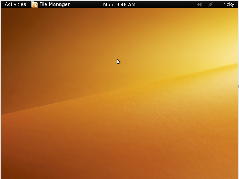
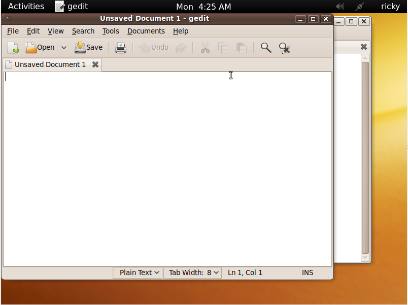
This is the screen you will be greeted with one you login to the GNOME 3 Shell. It seems like they have done away with the two panels system that we are used to in GNOME 2.x. GNOME 3 has just one panel at the top and it consists of five parts. Starting from left it consist of the following:
- The first from the right is Activities. This consist of the various avtivities that you can do – like launch a new application, search, go to a new location, recently opened files etc.
- Just to the right of Activities is where you get the name of the currently active application.
- Right at the middle, you get the clock.
- To the right of the clock you get the various applets running like the volume control, network manager etc.
- And to the extreme right, there is the name of the current user and by clicking on it you get the menu to log out, shut down and some other functions that we will be coming to later.
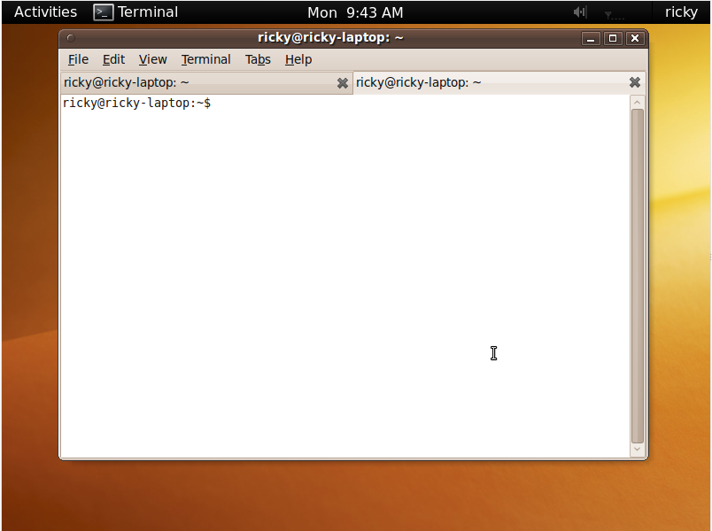
This is what an application running in GNOME 3 Shell looks like. Notice that “File Manager” next to Activities in the previous picture has been replaced by Terminal here reflecting the presence of the terminal as the currently active application.
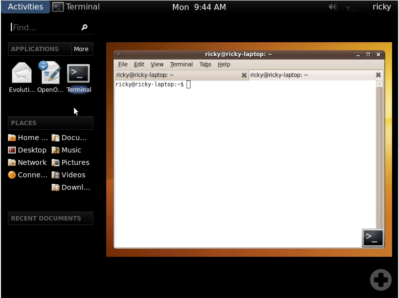
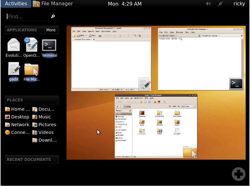
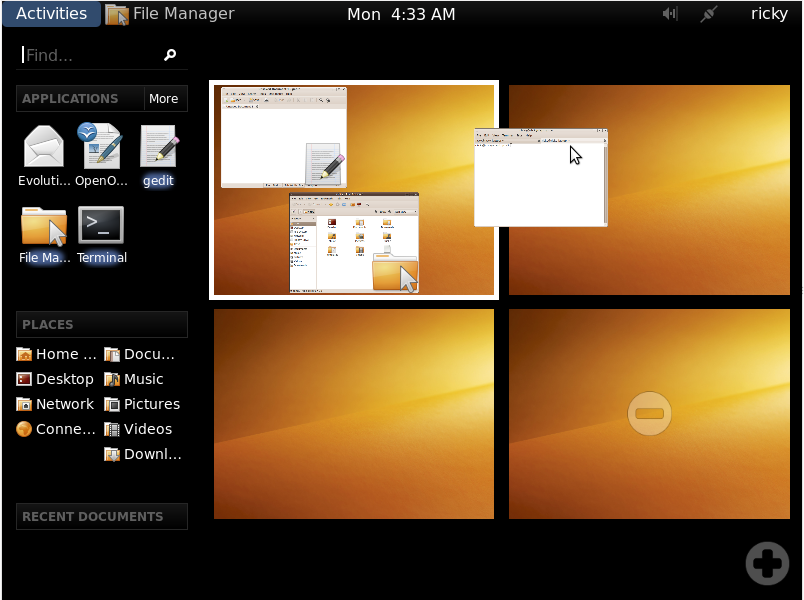
When you click on Activities, this is what you will get. The size of the desktop has been minimized a bit and a new menu comes up to the left. Starting from the top, the left panel consist of the following:
- A search box using which you can search for both applications and documents.
- Applications, which list the your favorite applications just below it. There is also a More menu you can go to to select other applications.
- Then there is the places listing the different commonly accessed folders like Home, Music, Videos, Documents etc.
- The last one is the Recent Documents under which recently opened documents come.
To the right, there is the desktop(s). If you have more than one virtual desktop, they all show up here. We will come to this again later.
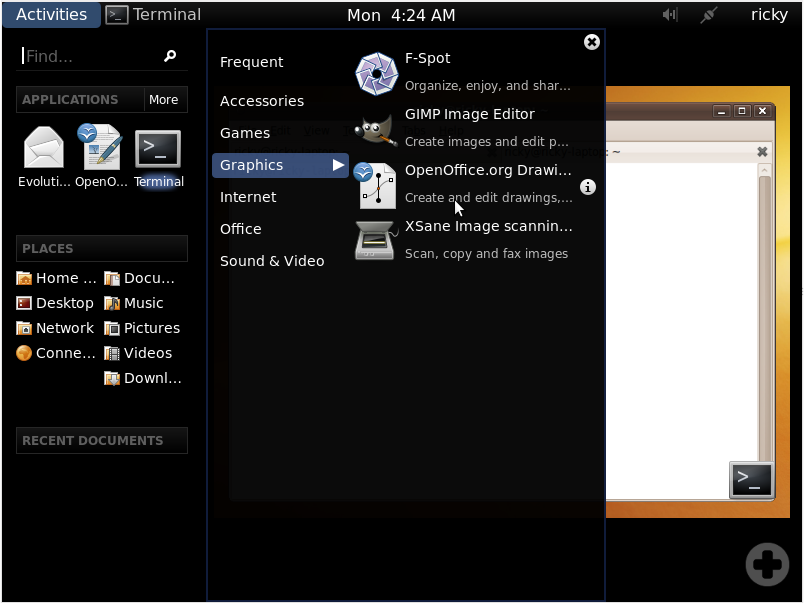
We mentioned the More menu next to Applications above. This is what clicking on it brings up. Basically it brings up two new panels. The left one list the various categories of applications and the applications available under that category is listed on the right one.
For this demonstration, I choosed to open Gedit from the menu seen the previous picture. So here is Gedit above Terminal and as Gedit is the currently active application, Terminal in the panel has been replaced by Gedit.
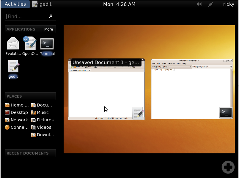
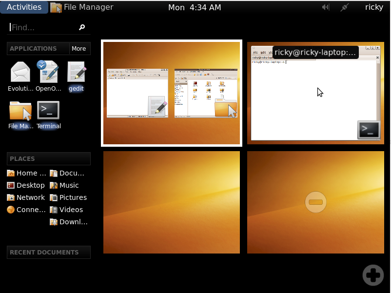
Now, if you click on Activities again, the two running applications are shown side by side and accompanied by their corresponding icons. When you hover the cursor over any of them, its name is indicated and by clicking on them you can go to that application. Also note that at the left panel under Applications, Terminal and Gedit are highlighted, indicating that they are currently running.
If you open more windows in the current desktop, the windows are automatically arranged to give you the best possible view.
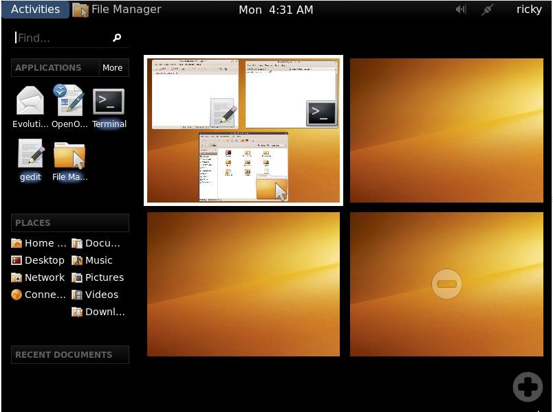
Now, what you are seeing here is arguably the coolest thing about GNOME 3. Instead of pre-defining the number of virtual desktops as was the case in GNOME 2.x, you can go on dynamically adding new virtual desktops by simply clicking the “+” in the bottom right. To go to any of the virtual desktops, just click on it. For this demonstration, I have added three more virtual desktops to make it a total of four virtual desktops. Notice that the active desktop is indicated by a white border.
If you want to get a window from one desktop to another, just click on that window and drag it to the desired desktop and drop it there just like you drag and drop a file.
And once you have dropped a window into a desktop, it assumes its proper position in that desktop and the desktop from which it came also rearranges the windows to give optimum view.
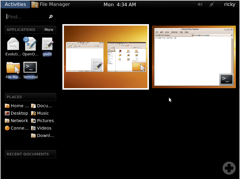
We have talked about how to add virtual desktops. To remove virtual desktops, all that you have to do is click on the “-” symbol at the center of each empty virtual desktop. In this demonstration, I have removed the last two virtual desktops.
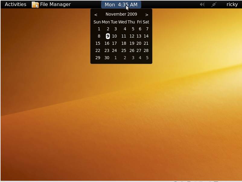
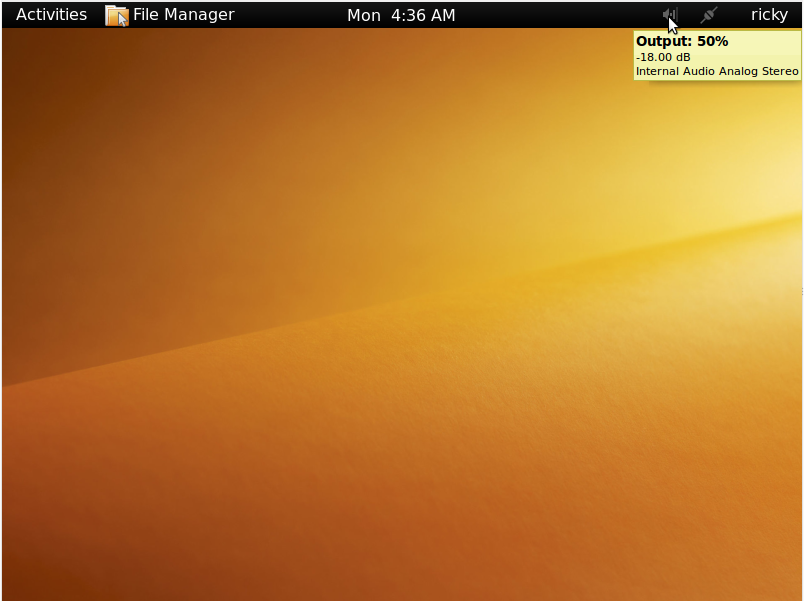
Going to the other parts, clicking on the clock drops down a calender.
Further to the right, we have the running applets. Here, I have the volume applet and the network manager applet running and the volume applet is being indicated by the cursor.
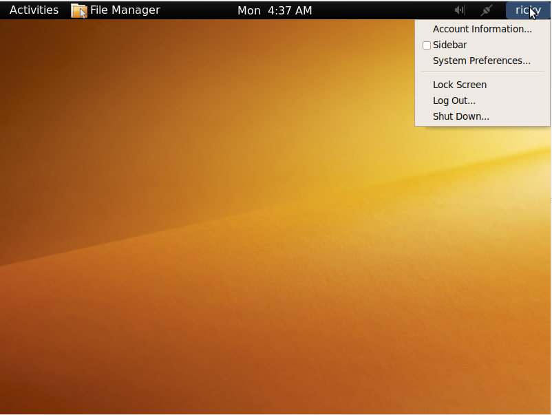
To the extreme right is the name of the current user. Clicking on it reveals a menu. Lock Screen, Log Out and Shut Down in the menu does the obvious. The other options are discussed below.
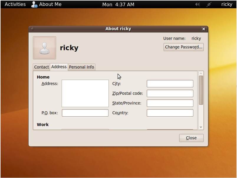
Clicking on Account Information brings up the window shown above. It basically shows informations about the current user. The password can also be changed from here.
Checking Sidebar, reveals a sidebar at the left of the desktop. The sidebar consist of the time, applications and recent documents. As of now this seems redundant to me and its utility is not clear when there is the Activities screen. The sidebar can also be minimized.
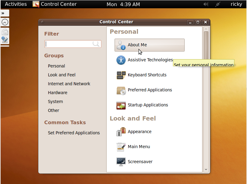
This is the Control Center which comes up when you click on System Preferences. From here you can modify various settings of your system. The minimized sidebar is also shown in the left.
With this we come to the end of our visual tour of GNOME 3 Shell. If you have any questions, opinions or any comment, feel free to discuss it in the forum or leave a comment below.
If you want to try it fist hand, go to this article.
