 YouTube is currently testing a new user interface codenamed “Cosmic Panda”.
After playing around with Cosmic Panda for a while, I can say that it is a much better interface than the previous one. With Cosmic Panda, the white background has been replaced by a darker background. This makes for a better viewing experience as the white background can be distracting sometime.
It is really difficult to explain all the changes that Cosmic Panda brings. So, let us take a look at some screenshots instead.
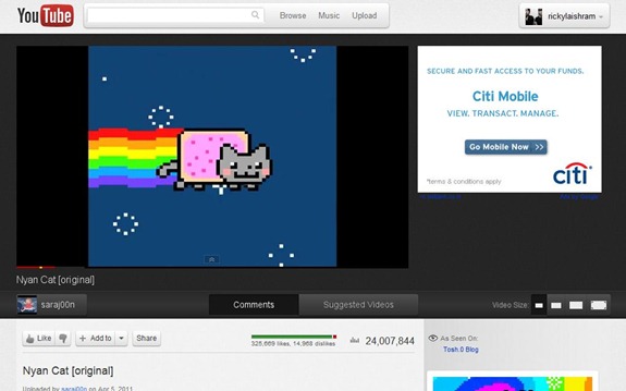
This is the new look of the video page in Cosmic Panda. As mentioned above, the white background has been replaced by a darker one. It cannot be shown with a screenshot, but various animation elements have been added as well. For example, when you click on the “Suggested Video” the videos slides in to the page below.
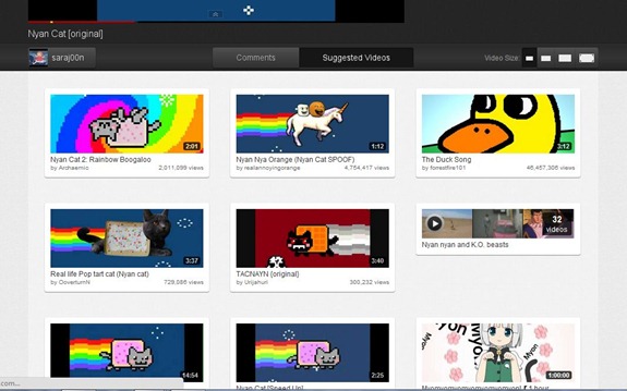
Talking about Suggested Video, this is what it looks like in Cosmic Panda.
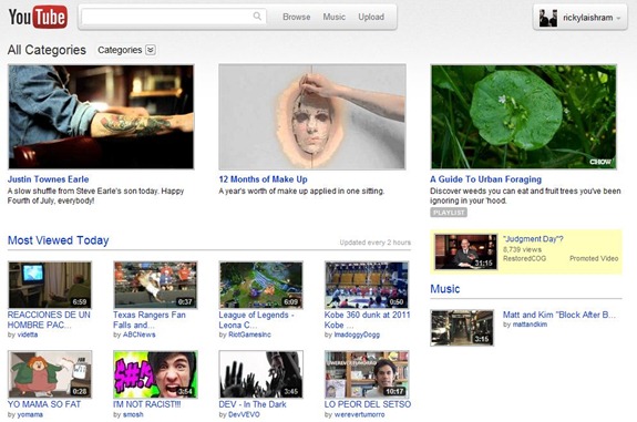
This, here, is the main page after activating Cosmic Panda. There are not much changes here.
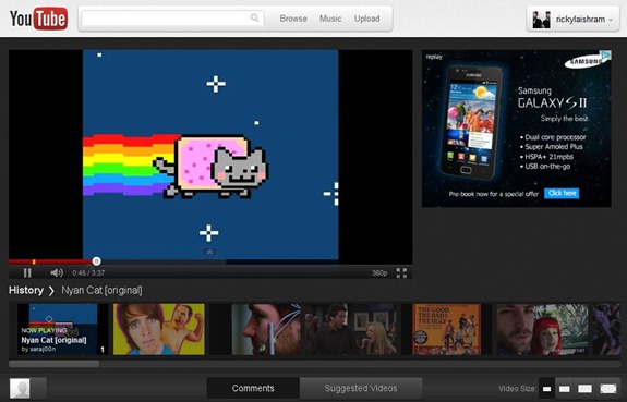
This is the new playlist player in Cosmic Panda. The various videos in the playlist are shown below the currently playing video.
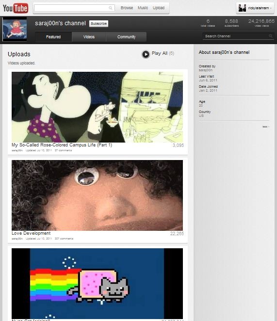
Finally this is the new channel view in Cosmic Panda. As you can see above, the Features videos in the channel are given huge real estate.
How to activate Cosmic Panda
Anyone who want to try Cosmic Panda can do so. To activate Cosmic Panda, go to http://www.youtube.com/cosmicpanda and on that page, click on the button that says “Try it out”.
That is all, go to any video on YouTube and you should have the new interface. If you want to give the developers any feedbacks, you can do so by clicking on the blue button on the left.